Splink
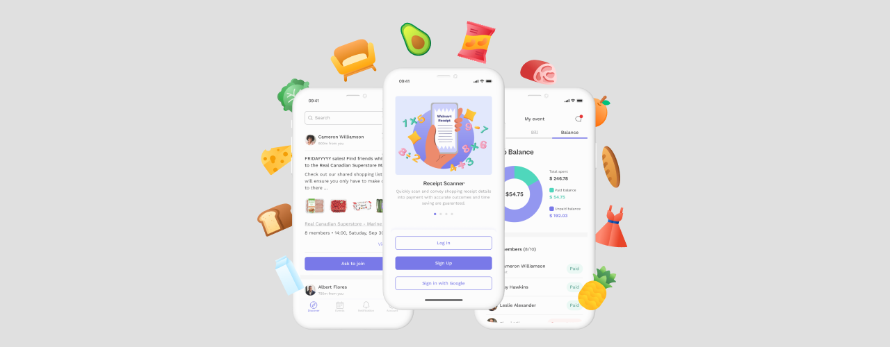
Splink – is a mobile application that gives users the ability to participate in community-based grocery shopping events, strengthening relationships with neighbors while finding grocery deals.
Background
This project is a result of a team effort of 8 professionals (3 designers and 5 developers), who successfully completed MVP in 12 weeks and presented it to stakeholders. The work on the project was carried out using the Agile methodology and in accordance with the designers’ and developers’ milestones.
My Role
My role in the project was UI/UX designer.
UX
- Actively participated in the ideation stage of app development, analyzing the problems consumers face, coming up with a solution, describing possible app features
- Performed UX research, interviewing prospective users regarding their grocery shopping experience at wholesale stores
- Completed competitors and market analysis
- Created Personas representing our target audience
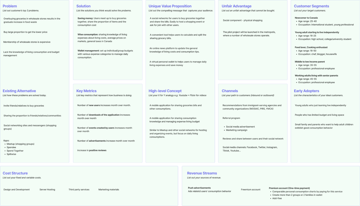
- Outlined Splink’s business plan on the Lean Canvas template
- Assisted with the user flow creation, suggesting areas for improvement
- Created annotated wireframes (account, group balance sections, landing page)
- Worked on documentation: annotated handoffs for developers, weekly project reports, UI Kit guidelines
- Contributed to the creation of the Design System, explaining UI components as well as animation, transition, and interactions of elements
- Developed marketing and monetization strategy
- Tested and evaluated app performance and design, reporting issues on GitHub
UI
- Created Moodboards featuring fonts, color schemes, and images, which helped to determine the brand identity and choose the design direction
- Designed logo variations and product icons to be considered by team members
- Created mock-ups (account, group balance, split the bill by members sections)
- Worked on the proposal, providing content, and creating pages: Tools, System Architecture
- Captured and edited team member’s photos, which were used in the proposal, marketing materials, and final presentation
- Created marketing materials: short promotional video, the script for the long video, logo animation, and social media banners for Facebook, Instagram, and LinkedIn
Research
Competitor analysis
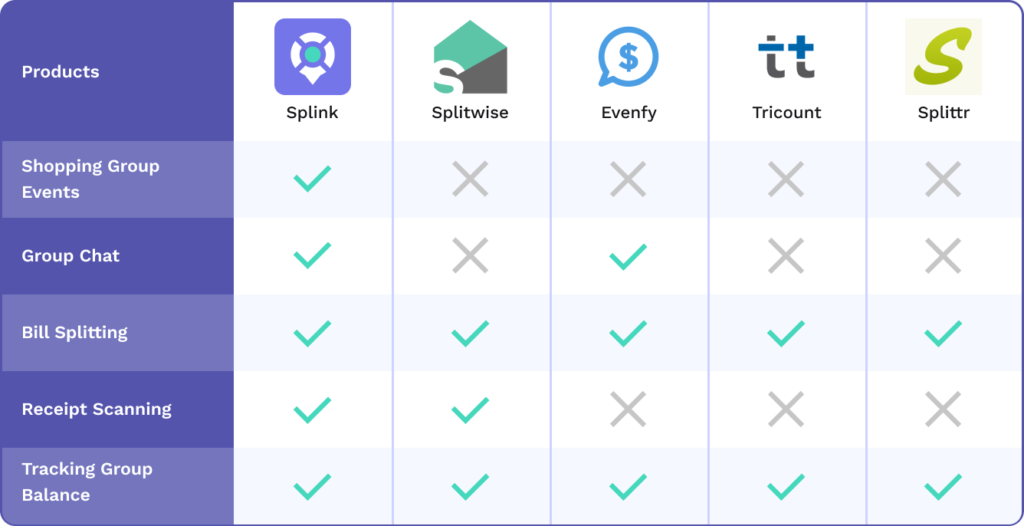
In order to define our strategy and win more market share efficiently I analyzed our competitors, using statistical data provided by the Similarweb platform, which collects information about the digital performance of 100,000s businesses worldwide. Research conducted gives our team a better understanding that from the competitors, the Splink application can stand out by implementing a social component – shopping group creation. The receipt scanning feature would emphasize app uniqueness.
Market Research
I conducted market research, from the perspective of Demographic, Geographic, Income, Psychographic, and Behaviour segmentation, which helped me to create Personas as well as outline my ideas regarding the Splink business model on the Lean Canvas.
Lean Canvas
Project Blueprint
User Flow
The user flow is a powerful UX tool that allows our team to visualize users’ interaction with the product and identify their concerns or roadblocks in the process of completing the tasks. As a member of the design group, I provided my suggestions regarding app features, the scope, and the level of app complicity, as well as discovered areas for improvement, working on User Flow iterations.

Wireframes
Working on the landing page of our marketing website as well as on the account and group balance wireframes, I accommodated different users’ scenarios, work through all elements’ interactions, and tested our design decisions.
Shopping Groups
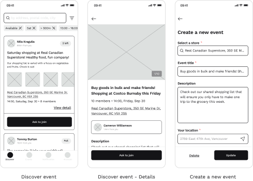
The user can create a shopping event, providing details and a preliminary shopping list. Or check ongoing events in the neighborhood and ask to join a group that meets users’ needs.
Tracking Group Balance
This feature allows tracking the shopping group balance presented transparently and accurately. Users will be notified about payment updates and send or receive reminders
to avoid payment delays.

Split Bills and Receipt Scanning
The easy and fast process of in-app receipt recognition as well as the flexibility to choose a payer and method of bill splitting: equally or by members improves the user shopping experience.
Group discussion, Notification, and Account
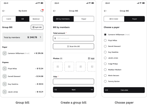
The chat function helps to clarify all the details before the event. Notifications convey information and updates, encourage users to engage with an app, and send reminders. An account allows the management of users’ data, contacts, and settings.
Branding
Logo


Colour Palette
Typography

- Our logo represents the following concepts: community, connection, location, and sharing. It reminds a map location sign and the bright circle inside can be interpreted as a meeting point, a close circle of people, unification, and rallying. Clear lines leading to the center resemble a road, an intersection, which indicates an organized activity.
- Readability and weight variations were decisive factors in the selection of Work Sans typeface for the body text and Cabinet Grotesk for the headings.
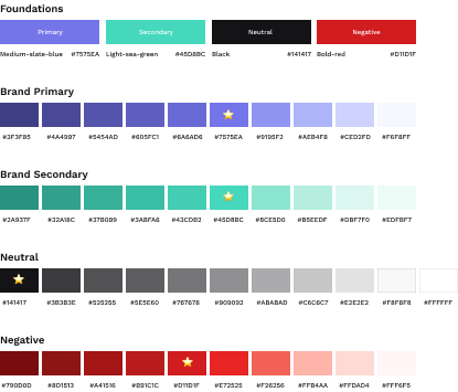
- The brand colors symbolize playfulness, freshness, and youthfulness. The combination between medium-slate-blue and light-sea-green creates a unified contrast and can easily attract human eyes on all digital platforms.
UI Kit
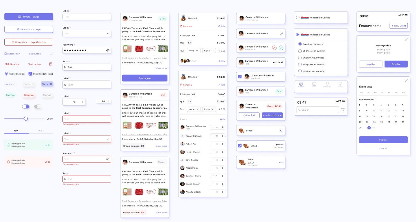
Splink has a dynamic UI kit that contains UI components such as buttons, input fields, cards, bottom sheets, top and bottom navigation, etc. with most of the important states from normal to long-pressed or dangerous. It helps us adapt the design to all situations and maintain design consistency.
Iconography
- The choice of outlined icons is dictated by the desire to create a light and unobtrusive design

Illustrations
- “>Illustrations explain the main features of our application, such as Shopping Groups, Receipt Scanner, Split The Bill, and Tracking Group Balance. Cohesive in mood and style, and moderately detailed, they add character to the Splink brand, while explaining the shopping event stages with humor. The heroes of the illustration sequence represent our target users: students, newcomers, and young professionals. Illustrations are used in the application for user onboarding purposes and on our marketing website.

Mockups
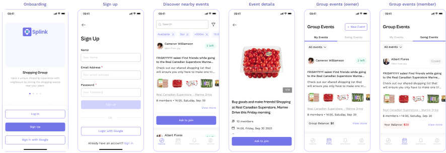
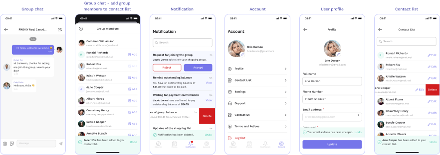
The creation of mockups allowed us to imagine the final look of the product, and check the design for consistency, and brand compliance. I worked on mockups of the following sections: account, the group balance, and split the bill by members and its iterations. In addition, I created detailed annotations for design handoff documentation.
Onboarding – Sign Up – Discover Events – Group Events
Create/Edit Event – Select a Store – Product List

Group Bill – Group Bill/Create – Select a Payer – Group Balance

Group Chat – Notification – Account – User Profile – Contact List
Social Media Assets
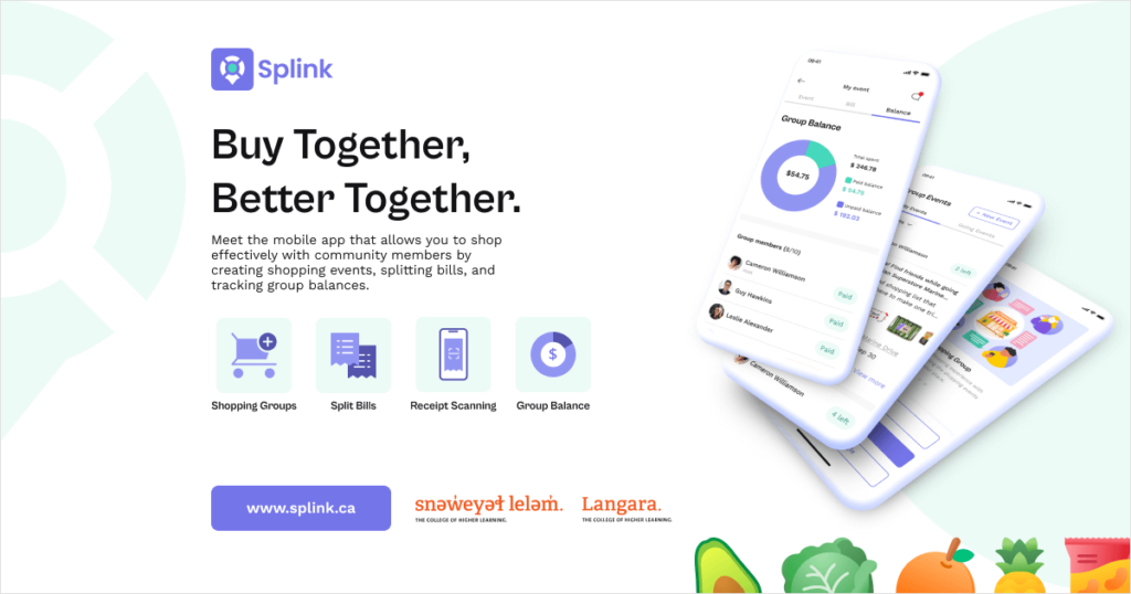
I analyzed the most relevant to our target users social media platforms, considering their Demographic (Gender, Age, Language, Geolocation) and psychographic (Interests, Behaviour) characteristics, and suggested our teammates post Splink video materials on Facebook and Instagram and Social banners on LinkedIn. Here is an example of a banner and logo animation made by me.
Tools Used


