The Victoria Division of Family Practice
The Victoria Division of Family Practice is a member-driven organization that represents, supports, and advocates for family physicians in Victoria, BC, to foster an engaged community and create meaningful change in local healthcare.
My Role
UX/UI Designer
I was responsible for redesigning a content-heavy division website with a focus on user experience and visual clarity.
Constraints
- Had to align with existing provincial branding and shared CMS templates.
- Limited flexibility in layout due to uniform style across all division websites.
Goals
- Information Architecture: Restructure content so it’s easier to browse and search.
- Content Prioritization: Highlight key resources (e.g., physician directories, community programs) without overwhelming users.
- Accessibility: Ensure WCAG compliance so content is usable by all (contrast, text size, screen reader compatibility).
- Mobile Optimization: Improve the mobile experience, since many users access resources on phones.
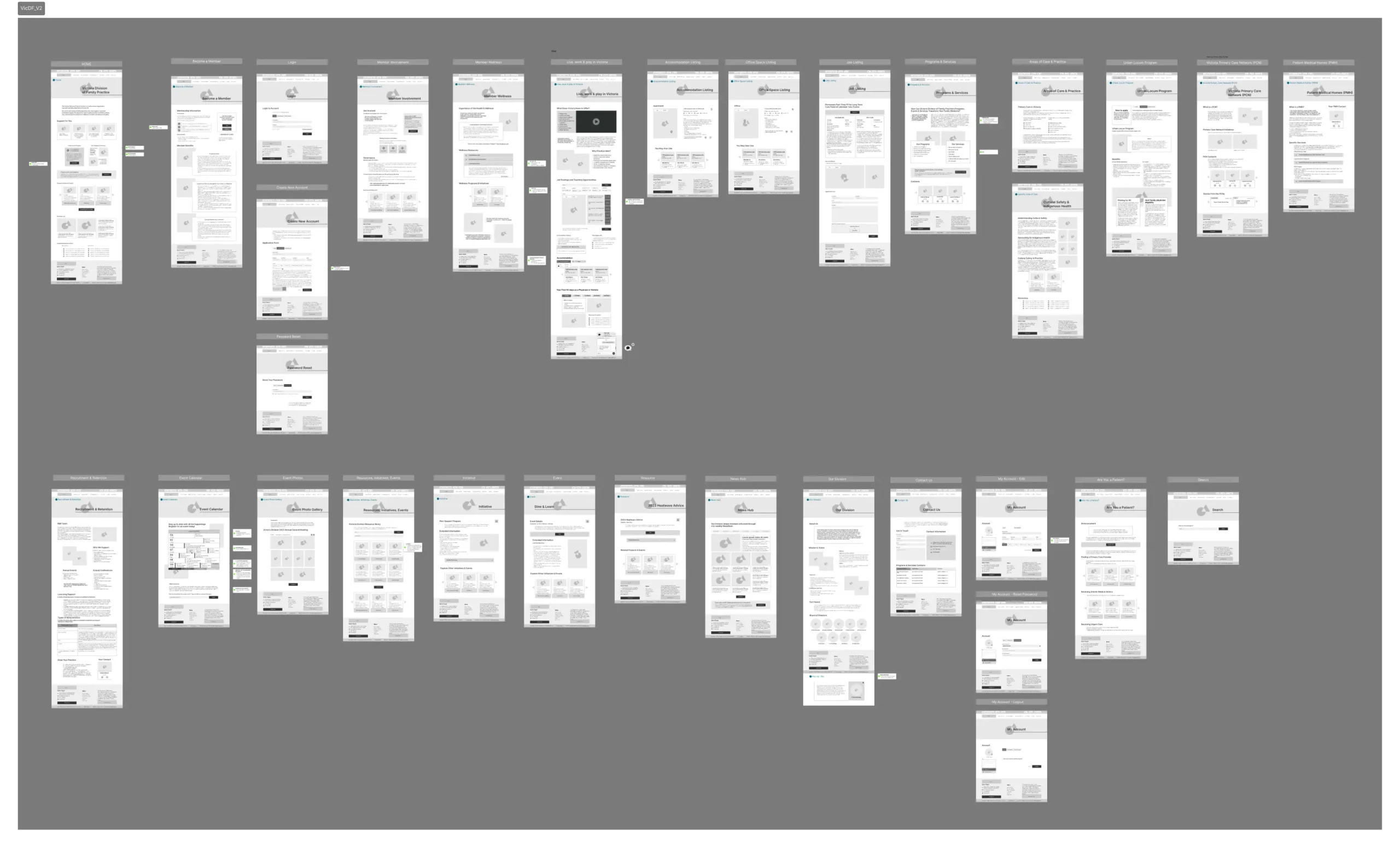
Site Map
See Original File in FigJam
Wireframes (examples)
Home, Our Division and Become a Member
Wireframes Patient Medical Homes, Event Calendar and News Hub
Desktop Wireframes 30 + pages
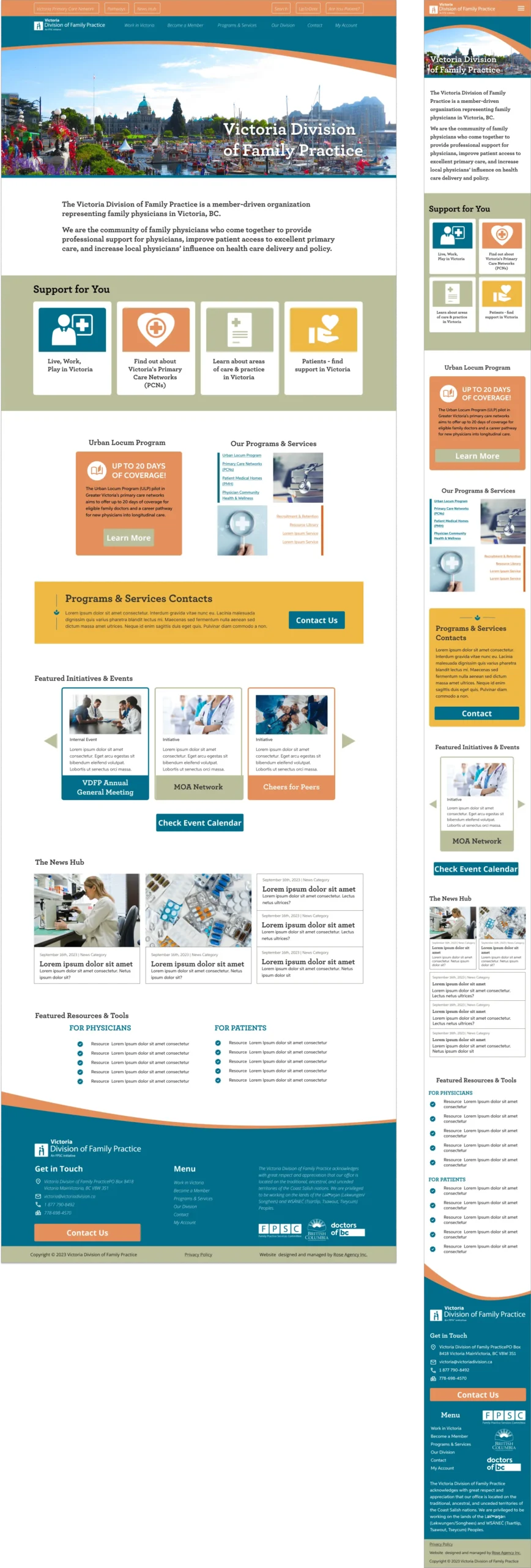
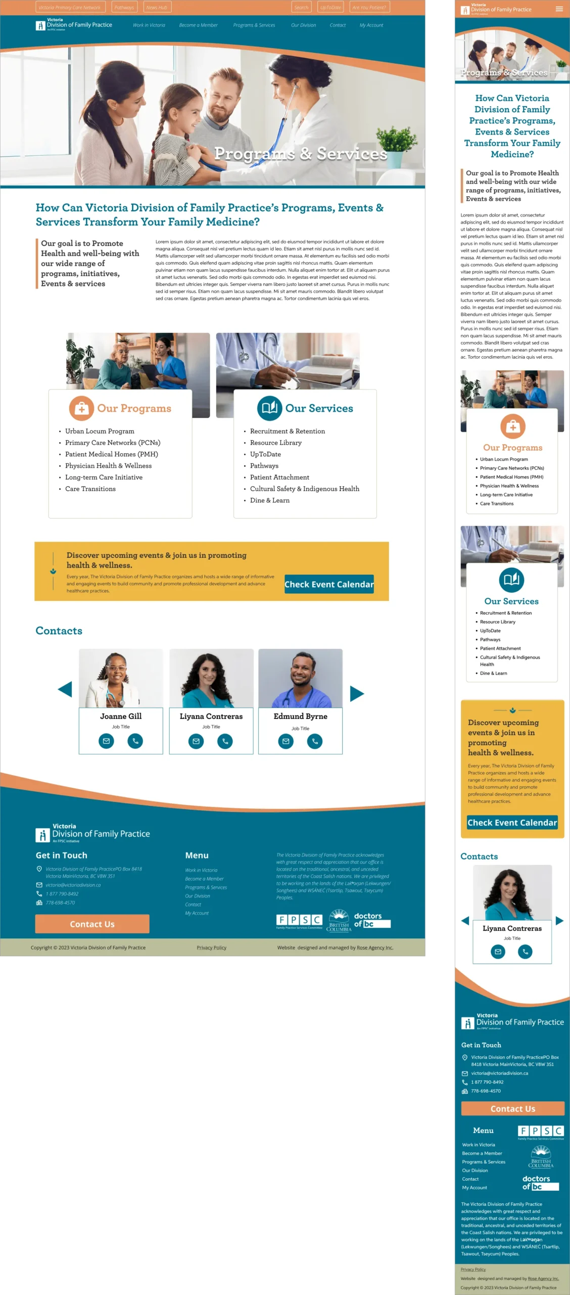
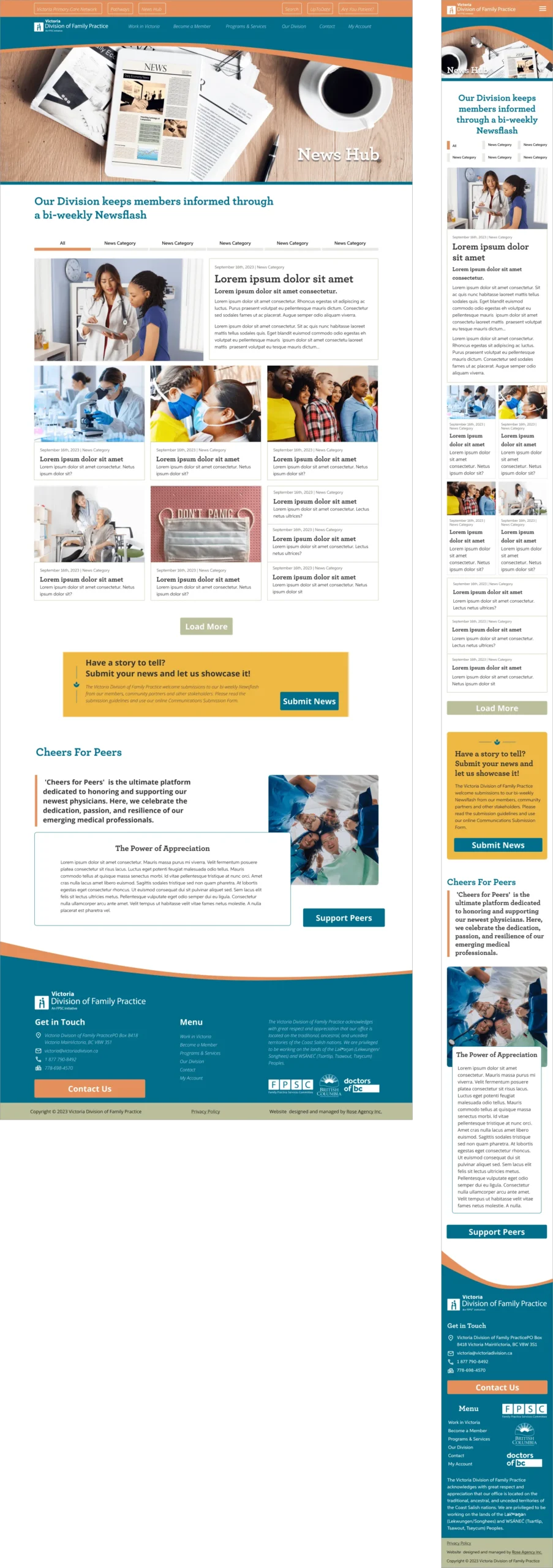
Mockups (examples)
Home and Programs and Services
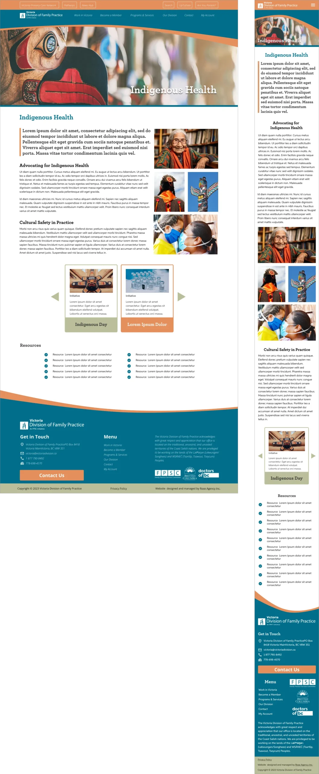
News and Indigenous Health
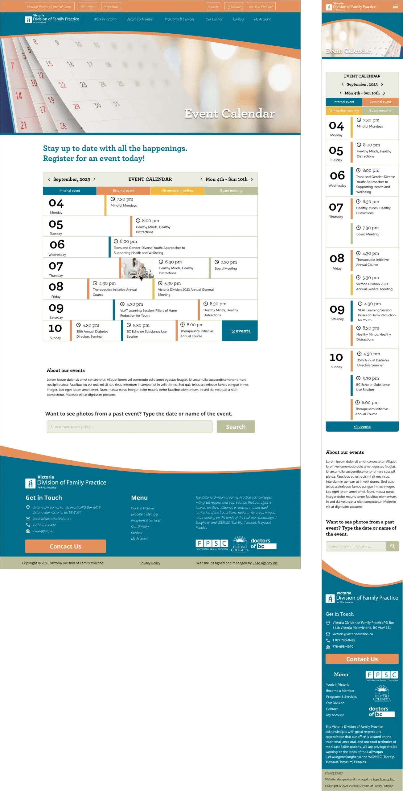
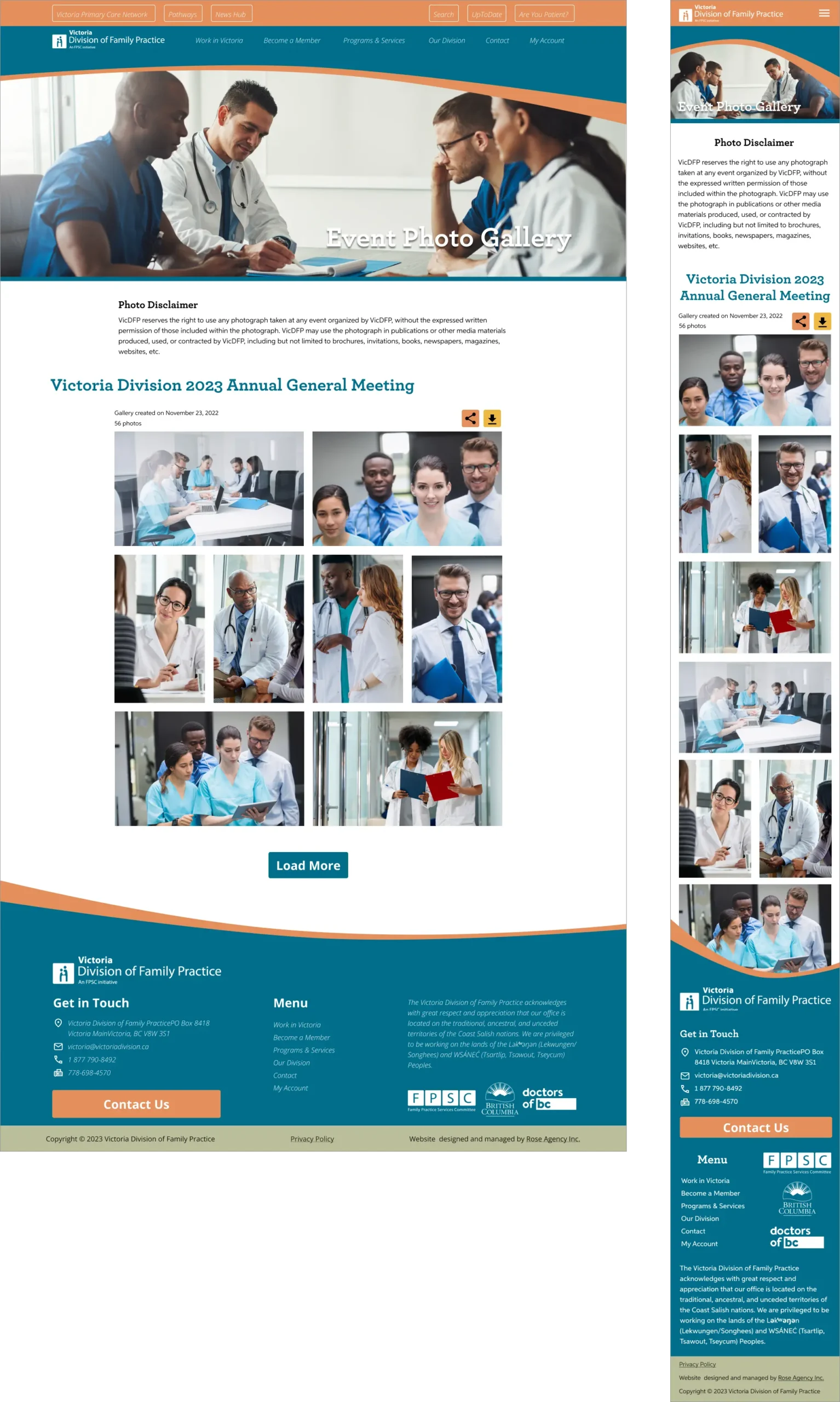
Event Calendar and Event Photo Gallery
Please visit www.victoriadivision.ca
Tools Used