Commodore Website Redesign
Commodore Ballroom has always been regarded as the premier performance venue in Vancouver. Hundreds of tickets are sold through the organization’s website every day, therefore it is necessary to keep the website representative and up-to-date.
Problem Overview
UX
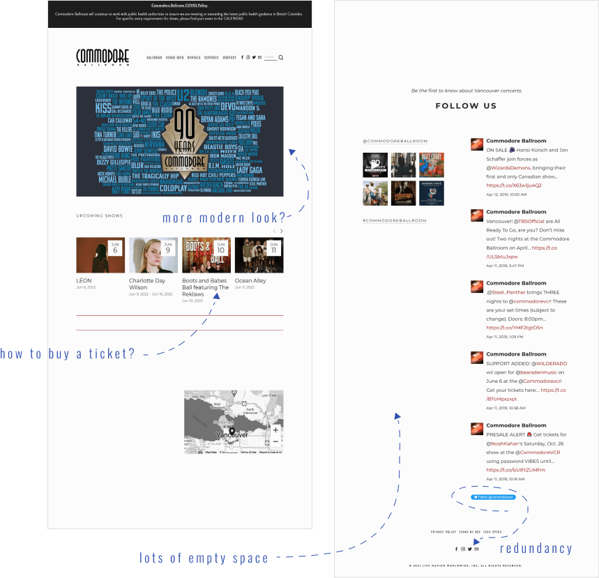
- Redundancy
- Confusing navigation
UI
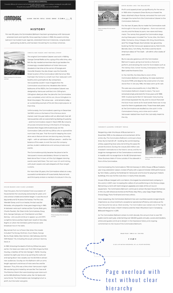
- Uneven distribution of content (a lot of empty space or the pages are overflowing with text or photos)
- Outdated look
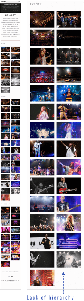
- Lack of visual hierarchy
Redesign Goals
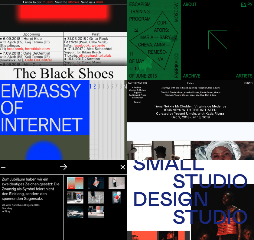
Moodboard: Brutalism Style
The Commodore Ballroom is a concert venue with long history and traditions (more than 90 years). When redesigning their website, I wanted to keep the references to the past and at the same time give it a more modern look.
For inspiration, I turned to the Brutalism style which gives more freedom in terms of mixing genres and styles. I adopted some of its principles like rectilinear edges, oversized typography, and overlapping design elements.
UI Kit
Colour Palette
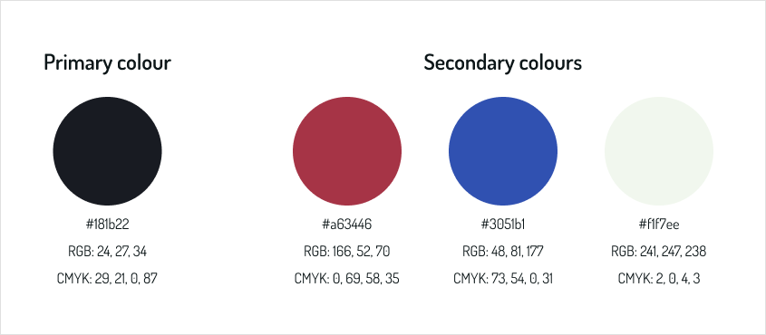
In the interior of cinemas and concert halls of the early 20th century, burgundy was used quite often (carpets, chair upholstery, curtains, etc.). My task was not to lose touch with the historical past of the venue, that’s why burgundy became my number one choice. This color speaks about luxury and elegance, exudes confidence, and shows stability and entrepreneurship. Dark blue communicates significance, depth, expertise, and stability.
Typography
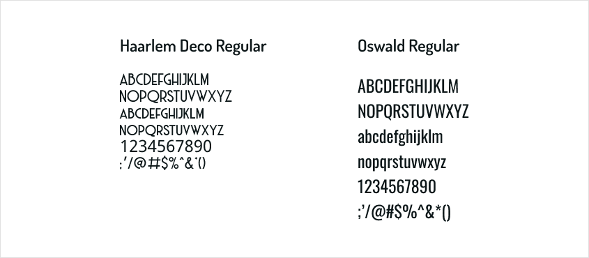
The font in the Art Deco style is presented in the company’s logo, which was the determining factor when choosing typefaces.
Icons
I chose the outline style of the icons as it is clean and modern. Also, against the background of saturated color, it is easily noticeable without distracting the user’s attention.
Buttons
Solid color rectangular buttons with slightly rounded corners work well with the geometric typography style. The disabled state is used for the sold-out tickets.

Current Website vs My Redesign
Home Desktop Before
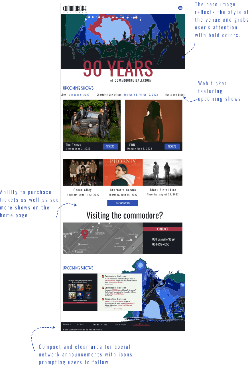
Home Desktop After
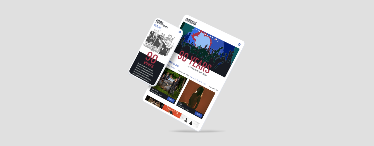
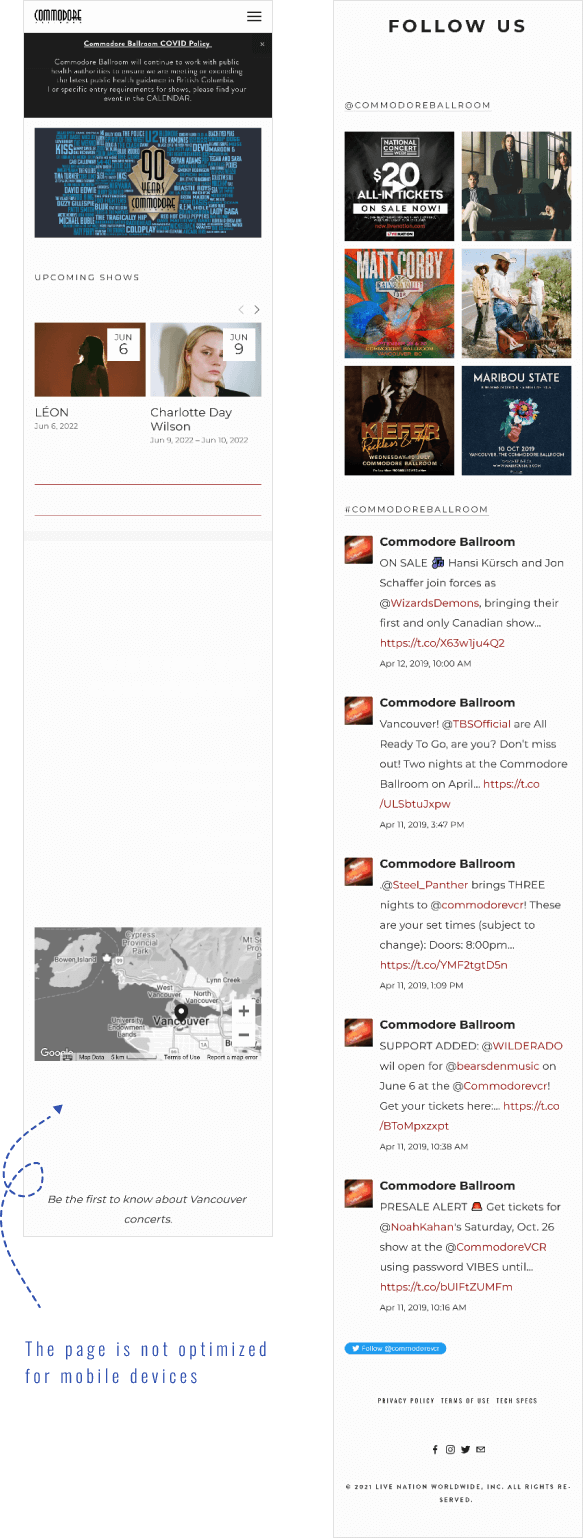
Home Mobile Before
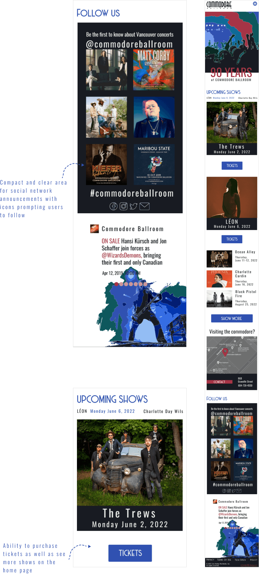
Home Mobile After
- Created fullscreen menu – accessible from any page, easy to navigate, and helps to understand website structure.
- Changed the hero image. The new version reflects the style of the venue and grabs the user’s attention with bold colors.
- Added a web ticker featuring upcoming shows.
- Provided users with the ability to purchase tickets as well as see more shows on the home page.
- Made area for social network announcements compact and clear and added icons prompting users to follow.
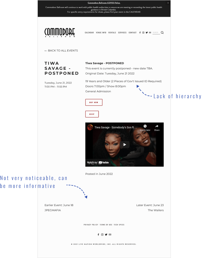
Event Desktop Before
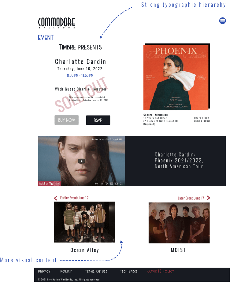
Event Desktop After
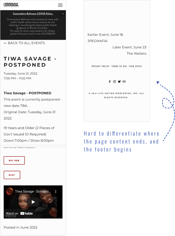
Event Mobile Before
Event Mobile After
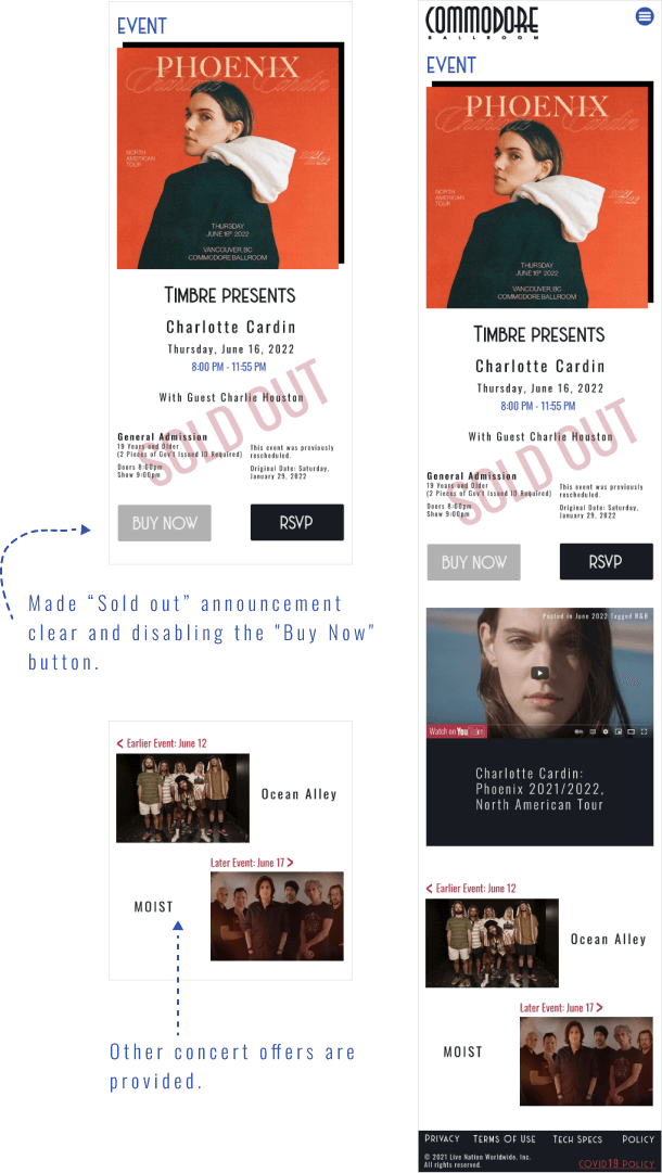
- Added more visual content.
- Followed a strong typographic hierarchy.
- Made an announcement about sold-out tickets clear by adding a text prompt and disabling the “Buy Now” button.
History Desktop Before
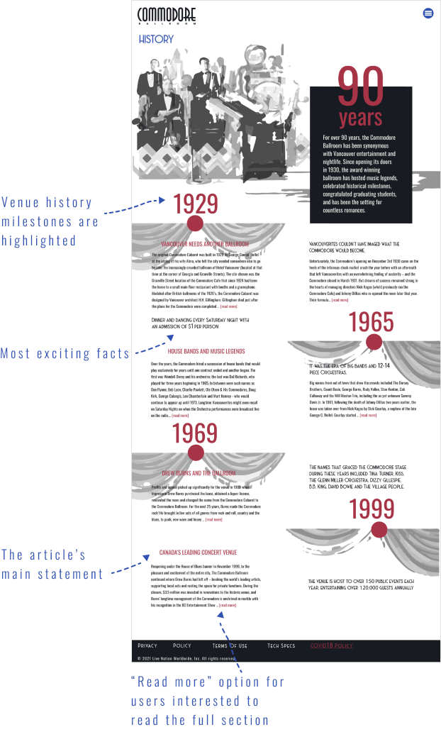
History Desktop After
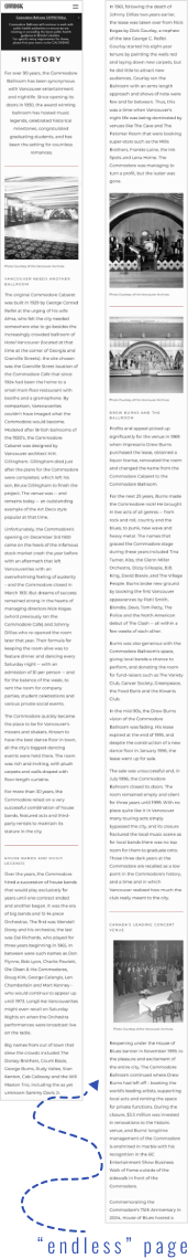
History Mobile Before
History Mobile After
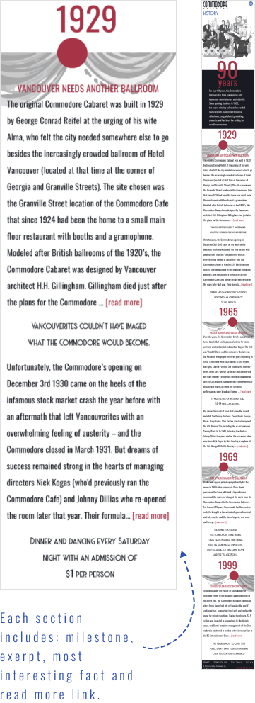
- Highlighted milestones on the venue history page.
- Decreased text overload by showcasing the most exciting facts, quotes, and the article’s main statements. Added “Read more” option for users interested to read the full section.
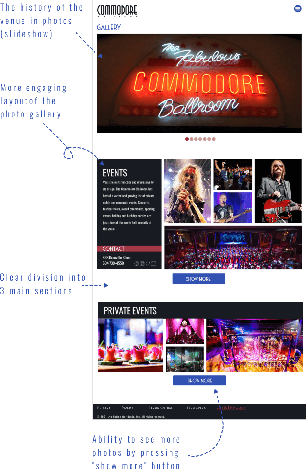
Gallery Desktop Before
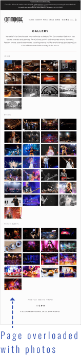
Gallery Desktop After
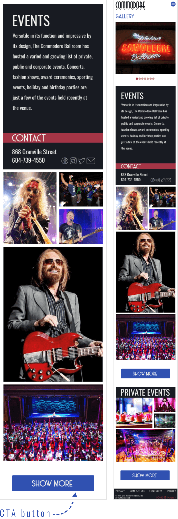
Gallery Mobile Before
Gallery Mobile After
- On the gallery page created a slideshow, that represents the history of the venue in photos.
- Made a footer more prominent. It gives a sense of stability and completion.
- The new layout is more engaging with a clear division into 3 main sections. It also gives users the ability to see more photos by pressing the “show more” button.
Tools used