Flair Airlines UX Redesign
Flair Airlines is a Canadian low-cost airline headquartered in Edmonton, Alberta. Flair Airlines travel app allows users to search, book flights, manage bookings, check flight status, as well as provide necessary information to assist in trip planning.
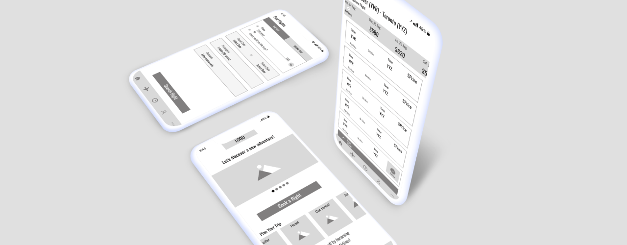
Problem Overview
UX
Redundancy
Unreasonable repetition of steps required to complete a user task, which may be confusing. Two types of menus: hamburger menu and bottom navigation bar with sections that have different titles but lead to the same pages.
Inconsistency
Misleading, inconsistent names for the buttons.
Modify flight booking – limited access
Options are limited. You can modify booking details only from certain pages.
Confusing Sign Up process
If you didn’t sign up at the beginning and choose to book a flight as a guest, you will be asked to fill in the passenger info (full name, date of birth, email, phone). From this moment the application considers you as a registered user. If you check your account later, you will get a prompt message to sign in instead of sign up. However, you never had an opportunity to create a password.
Hidden Content and Buttons
Content at the bottom of the home page as well as the call to action button can not be found easily. There is no hint for the user that the page is scrollable.
Redesign Goals
- Improved structure
- Logical transitions to other pages
- Clear names of buttons and sections
- Ability to modify flight booking details from any booking-related page
- Sign in and sign up process – straightforward and helps to increase the number of members
Design Process
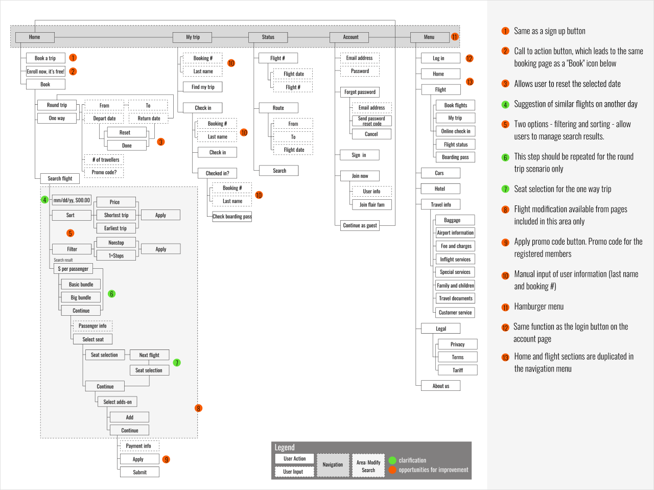
Current User Flow
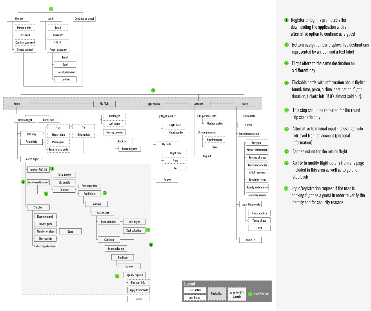
Updated User Flow
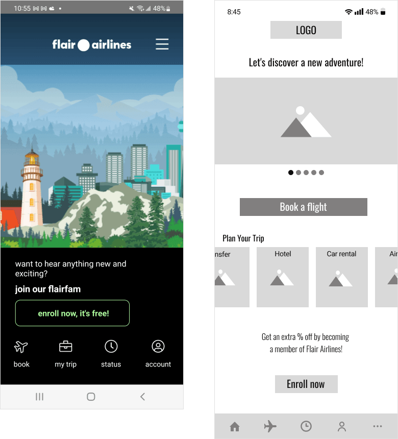
Current App vs My Redesign
Home Before & After
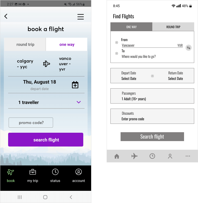
Find Flights Before & After
- Added Featured Image Slider displays photos of popular destinations operated by Flair airlines.
- Included the “Plan Your trip” section, which provides the user with suggestions of hotels, car rentals, airport transit, and other useful resources for trip planning. Created it in a scrollable carousel format.
- Placed text after carousel, giving the user a hint that page can be scrolled down.
- Changed the name of the CTA buttons to more concise and easily understandable (“Enroll now”, “Book a Flight”).
- Moved the section, which originally was shown in the hamburger menu to the bottom navigation bar. Information can be accessed by pressing the “More” button.
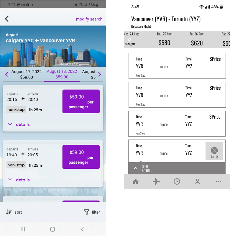
Departure Flight
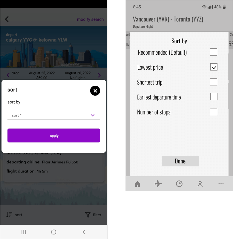
Sort By
- Created cards with information about flights found: time, price, airline, destination, flight duration, and tickets left (if it’s almost sold out). In comparison to the original version, the cards are clickable and the user can access additional flight details.
- Added a sticky “Sort by” icon that opens a pop-up page with options for flight search results sorting. “Sort by” options are presented in a clear manner. Checkboxes permit a user to make a choice easily.
Profile Info Before & After
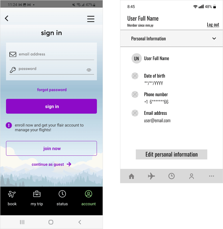
Profile Edit After
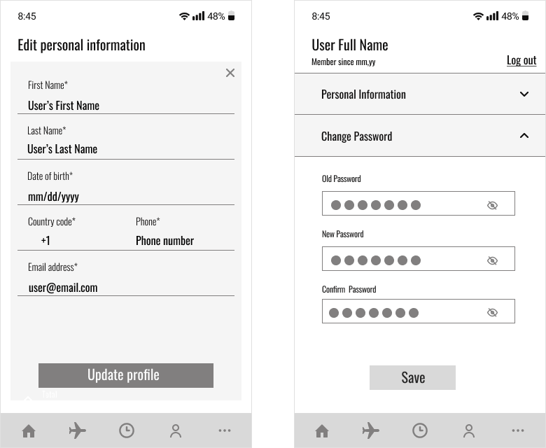
- In order to optimize the booking process I made all fields in the “Personal Information” section mandatory, as this information will be used to auto-fill the form when purchasing a ticket.
- Provided user with a suggestion to Sign in and sign up after the app download. From the account page, a user can modify the information provided, log out and change the password.
- Reduced cognitive overload for a better user experience by combining information and creating several dropdown lists. In the original version user’s profile information was displayed on separate screens.
Find My Booking Before & After
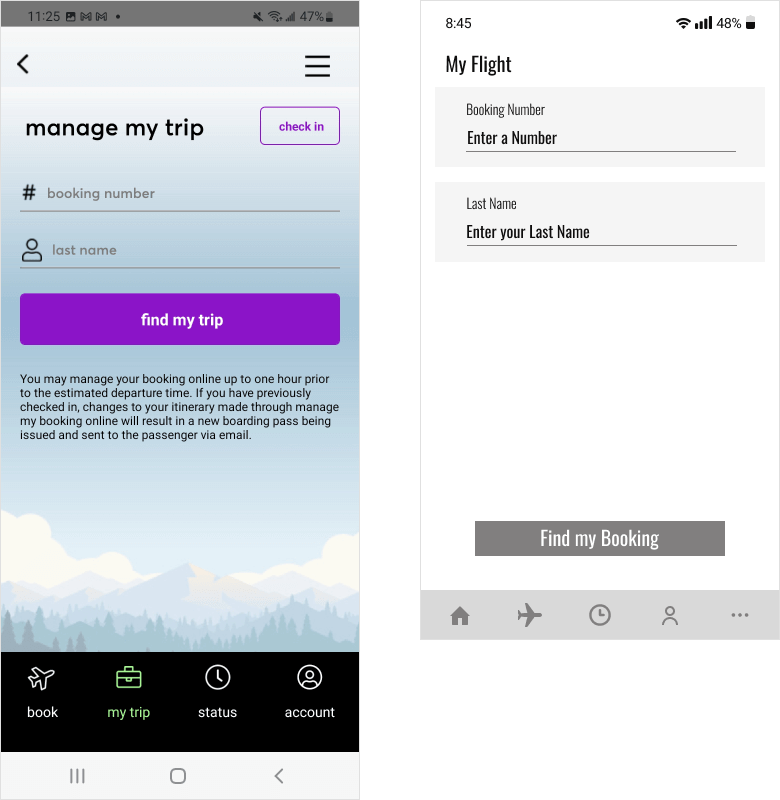
Check-In Before & After
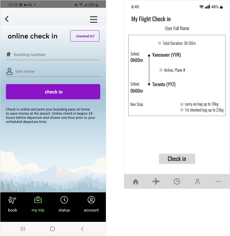
- Changed the button name to more specific “Find my Booking” for clarity.
- Provided users with an opportunity to review flight information before check-in.
More Before & After
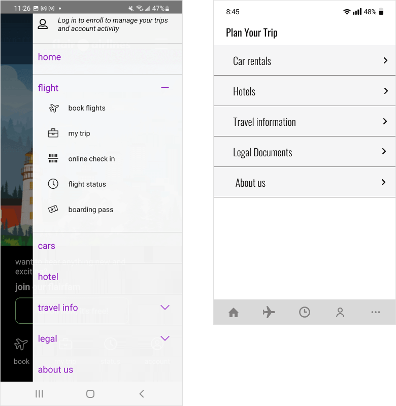
- Logically organized the display of information regarding trip planning. A user can view it by pressing the “More” button.
Tools used


