VSO Mobile App UI Redesign
The Vancouver Symphony Orchestra (VSO) app is intended for tickets purchases and receiving information about concerts, programs, and events. This is a free application. Supported platforms are iOS and Android.

Problem Overview
UX
- Redundancy
- Confusing navigation
UI
- Lack of visual hierarchy
- Overuse of accent colour red
- Low contrast affecting readability
- Absence of a company logo
- Pixelation of low-resolution images
- Alignment of elements
- Inconsistent style of icons
Redesign Goals
Working on the redesign of the application, I considered the needs of the VSO’s target audience, which primarily are seniors and middle-aged people. Minimalistic, clear, flat design, focus on the visual representation of information, high contrast, text readability, large buttons in couple with intuitive navigation will improve user experience.
UI Kit
Colour Palette
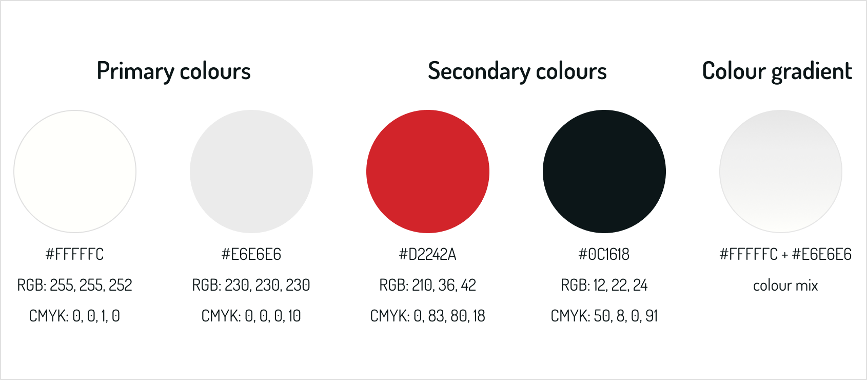
My choice of colour palette is based on colour psychology, the branding identity of VSO, and meets accessibility standards. I choose white and light gray as the primary colour in order to bring airiness, light, transparency, and purity to my design. Red is the branding colour of VSO and the interior décor of the venue. It’s emotionally intense, passionate, and powerful while perfectly serving as an accent colour. Black is elegant and classic and in combination with red and white creates an atmosphere of solemnity.
Typography
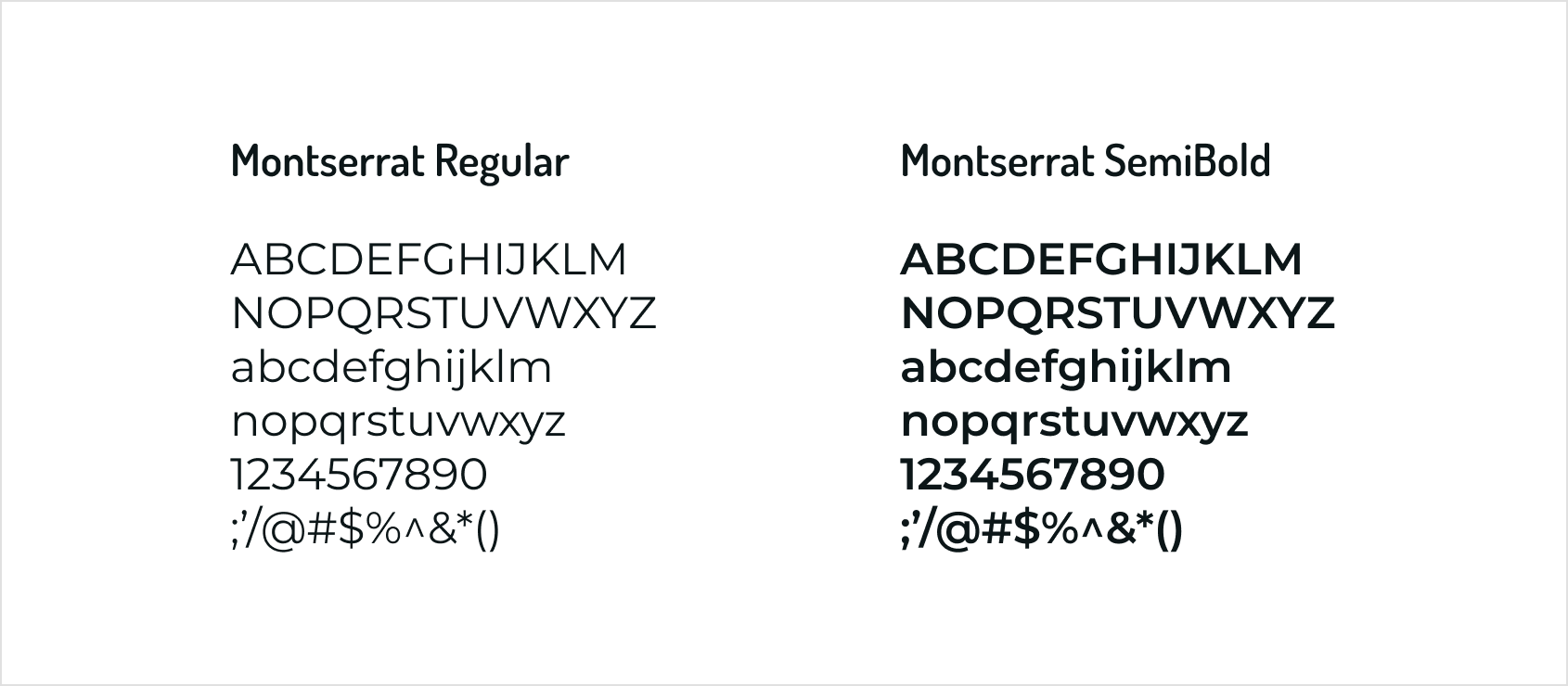
Montserrat is a geometric sans-serif typeface. Even in small sizes, it has high legibility because of a large x-height, short descenders, and wide apertures. Its incredibly important, especially when seniors and middle-aged groups are your target audience.
Input Fields
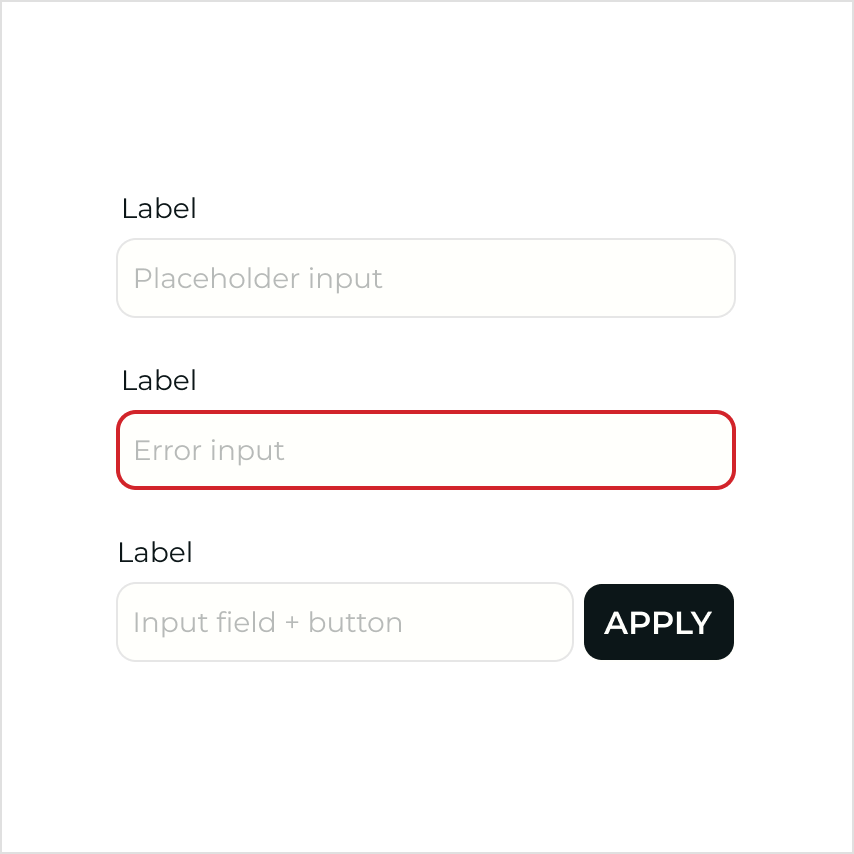
Input fields can be combined with a secondary short button. An input error is indicated by a red outline.
Buttons
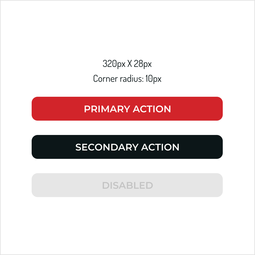
Buttons are wide with highly visible capitalized text. For the primary action, red color was chosen for its ability to attract user’s attention.
Iconography, Navigation
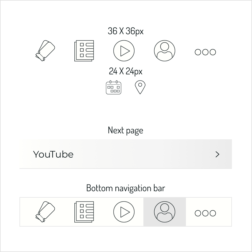
An outline style was used for the icons that give a feeling of lightness and clarity.
Current App vs My Redesign
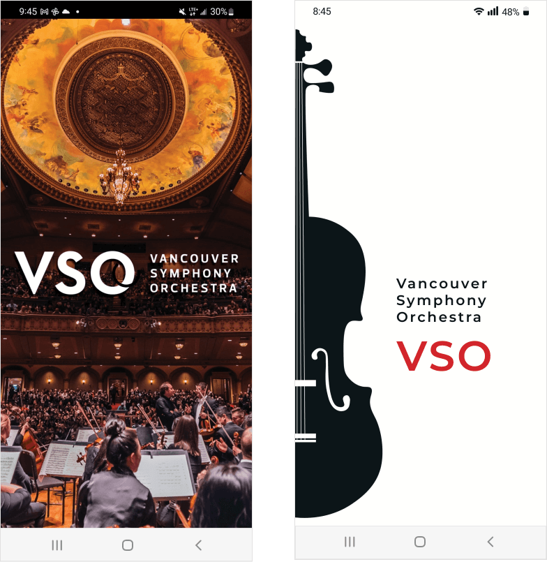
Splash Screen Before & After
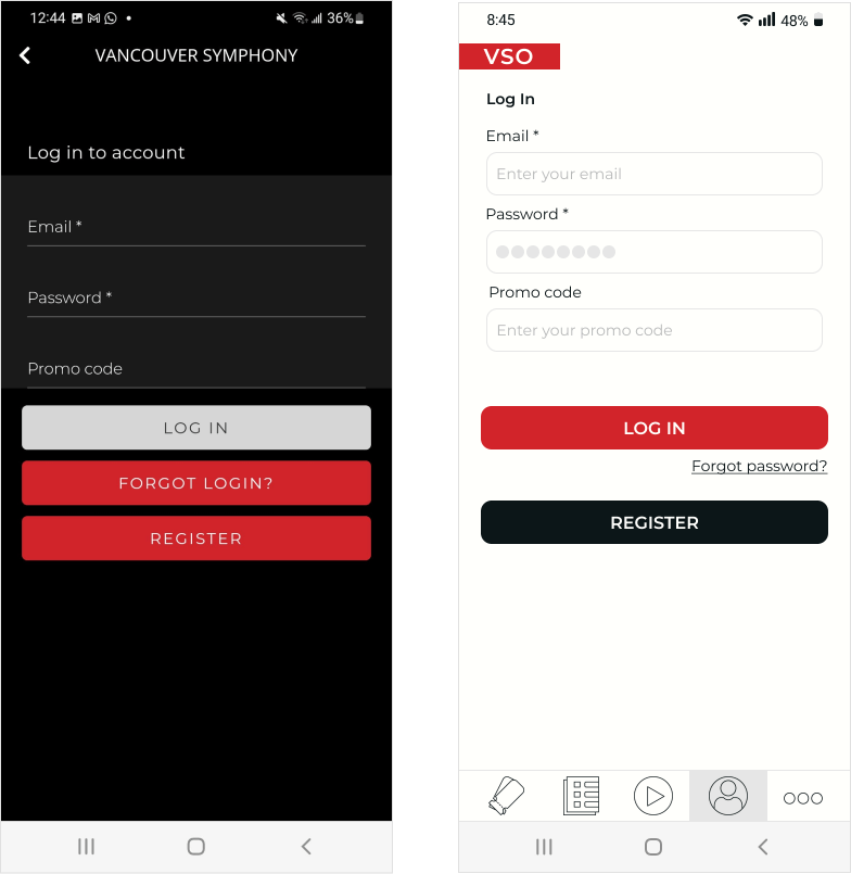
Log In Before & After
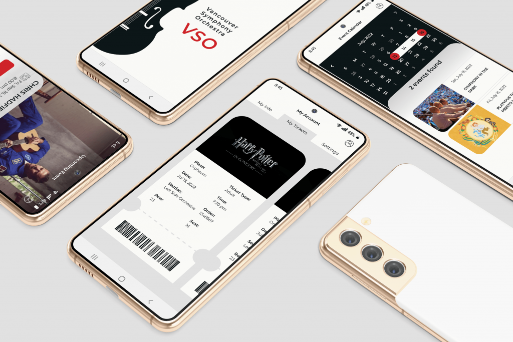
- Violin is called the queen of an orchestra and I decided to place this musical instrument on the splash screen. My goal was to create a stylish and memorable design. Also in comparison to the original version with an abundance of colors, now the users’ attention focuses on the name of the organization.
- Provided the user simple and familiar login/registration experience with two buttons and forgot password hyperlink.
- Used labels and placeholder text in all forms with input fields (such as login, registration, etc.) for accessibility purposes.
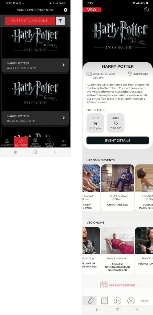
Home Before & After
News Before & After

- Buying a ticket is the main function of this application and the most often visited page. That’s why I made it a home page and also changed the order of the icons in the bottom navigation bar.
- Highlighted a featured event by using a hero image and detailed text description. The user also has an opportunity to review other possible event dates.
- Created a carousel of interactive, visually appealing cards, which provides additional information about upcoming and online events and encourages users to learn more about events, resulting in increased sales and improved user experience.
- On the news screen, I showcased a featured article with a short excerpt and date of publishing followed by clickable news cards.
- Decided to display the official logo of the organization on the main screens.
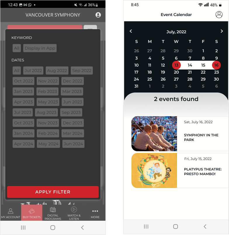
Event Calendar Before & After
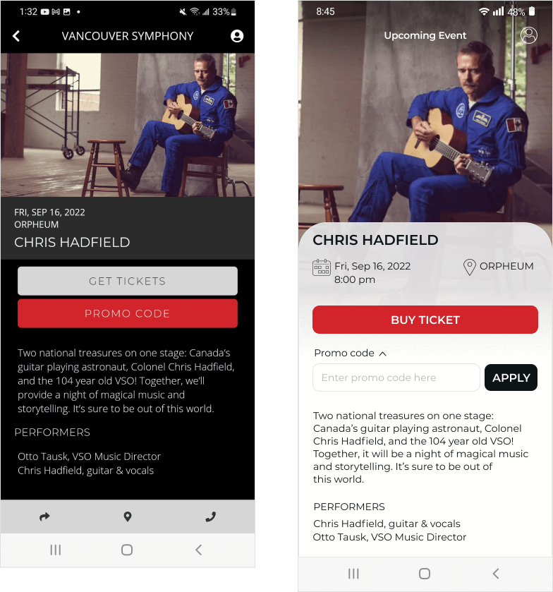
Single Event Before & After
- Added a well-organized and functional calendar. It displays the events that will take place on the selected dates. The user has an opportunity to proceed to the event page by pressing the card.
- Replaced promo code button on accordion menu revealing the hidden information – promo code input field with a button.
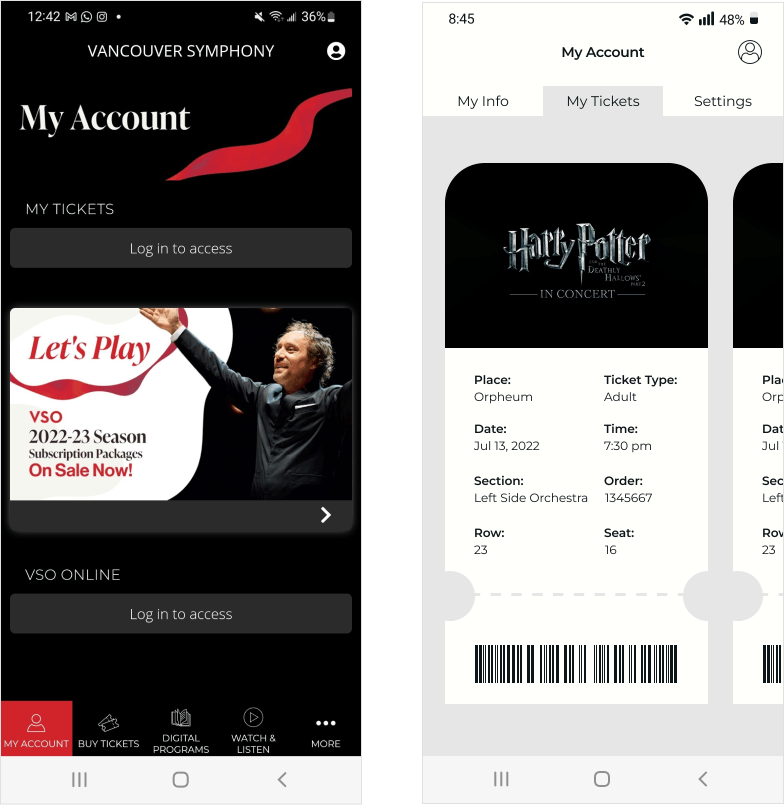
My Account Before & After
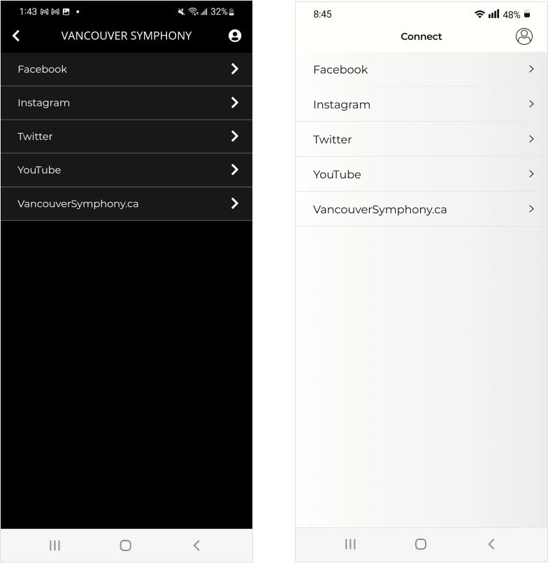
Connect Before & After
- Designed an electronic ticket, displayed on the screen of a mobile device, which simplifies the process of entering the venue. It also provides all necessary information to the user and can be easily accessed through my account page. Users can swipe to the right to see other tickets purchased on the same transaction.
- Made a list of social networks easier to read. The user will be redirected to the business page of the organization by pressing the corresponding arrow.
Tools used