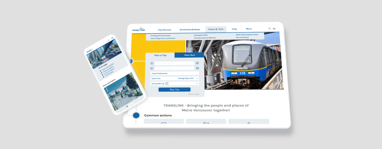
TransLink website redesign
TransLink is a Metro Vancouver’s agency, responsible for regional transportation. The design challenge was to make navigating the website intuitive and fast while maintaining the richness and complexity of the content.
Problem Overview
UX
- The current website is not optimized for the mobile screens
- Confusing three-level navigation top bar menu with redundant categories
- Redundant content or unrelated to this particular category
- Hero images represent subject matter, however, they don’t set the tone of the page due to their low artistic value
UI
- Outdated visuals
- Layout issues: web page elements are oversized and inconsistent, the page margins are too narrow
- Spacing and alignment issues
Redesign goals
- Redesign pages of the website, which showcase different features (calendar, search, photo gallery, map, etc.)
- Analyze the website content and divide it into three categories: crucial, optional, and irrelevant. Create page layout according to findings
- Minimize the cognitive load on users by narrowing or supplementing the navigation options
- Convey TransLink brand personality through color and style
- Provide recognisable and memorable icons
- Use unique, concise, and descriptive labels
- Replace confusing forms with well-structured, guided, and brief alternatives
- Remove unnecessary buttons, and provide the user with an opportunity to access additional content by clicking on the cards
Project constraints
- The content of the website needs to be reviewed, updated, or archived, but such changes are not within my jurisdiction. I organized and prioritized the presentation of the information instead.
- The brand of the organization must be taken into account.
- A content-heavy website can affect the page’s load speed which requires the designer to make informed decisions regarding the quality and volume of photo and video products used.
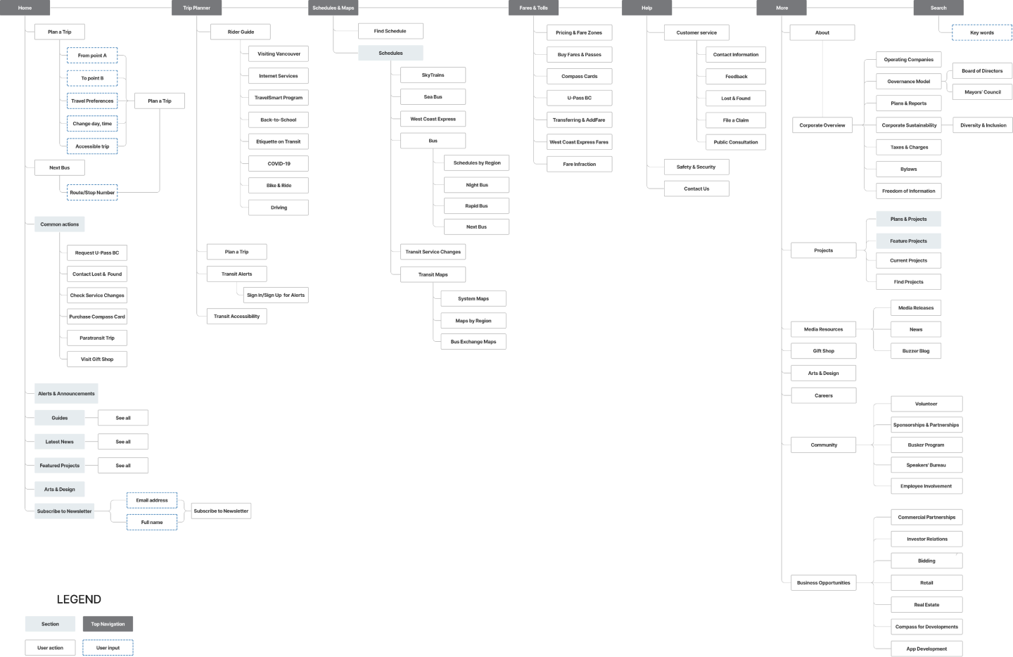
User Flow
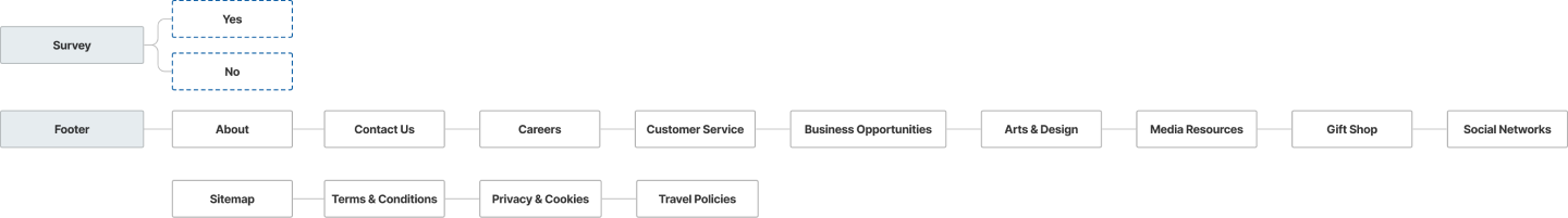
Footer
Working on the user flow, my main goal was to reduce the number of steps required for the user to access the desired information. For this purpose, I have combined and rearranged some of the categories. Also, I shorten their names, since the links or buttons must include meaningful, but condensed text.
Since the main objective of this website is to provide quick access to resources to passengers who are planning a trip or are on the road, I have placed in the menu and on the home page only essential and most commonly requested information.
Wireframes
Desktop
Mobile
UI Kit
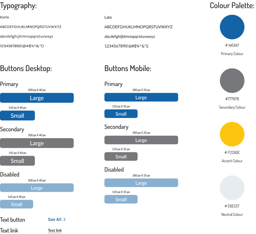
Colour Palette
The choice of the colour palette was based on the brand colours of TransLink, which are blue and yellow. The use of these colours on the company website helps strengthen brand awareness.
Moreover, according to colour psychology and theory, colours and their combinations elicit different emotions. For example, blue symbolizes professionalism, reliability and safety. It is the colour of the sky, which echoes the name of the Skytrain system. Yellow evokes happiness and optimism, but it is also an attention-grabbing, warning colour, that’s why I am using it as an accent colour.
Dark Gray “Asphalt” colour and neutral light blue have a calming effect and balance the contrasting combination of TransLink.
Typography
The clarity and simplicity of the Lato font, which I use for the body text, make it easier to perceive the abundance of textual information presented on the site.
For the headings and information, I wanted to emphasize, Karla typeface was used. Karla is a grotesque sans-serif typeface with personality and good readability since the spacing between characters is set a little wide, than usual.
Buttons
Rectangular, slightly rounded buttons with highly visible text encourage the user’s action.
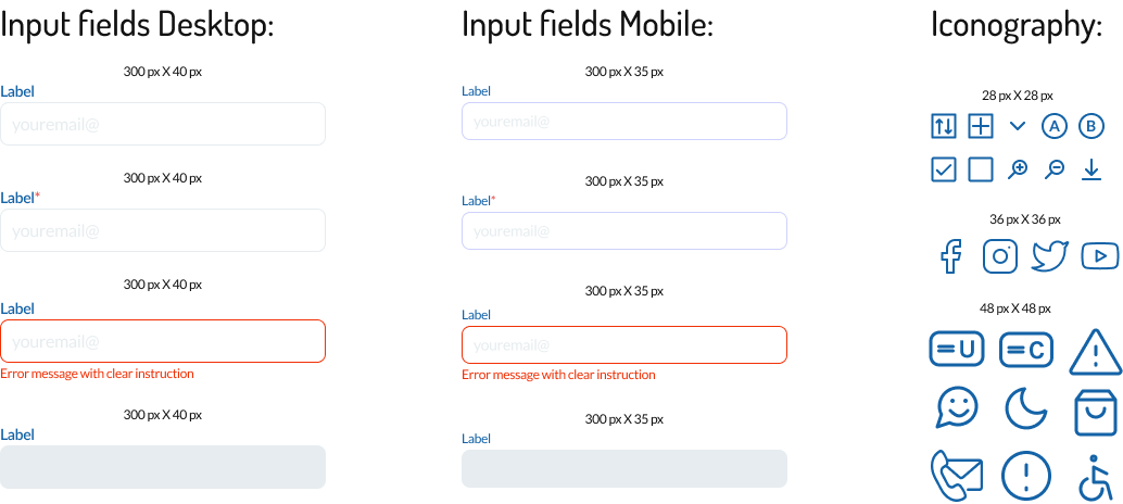
Iconography
Outlined icons are noticeable and recognizable. Accompanied by labels where needed.
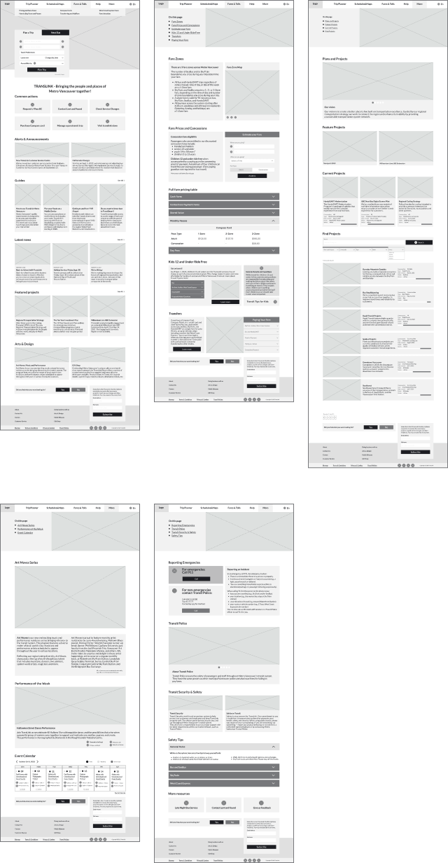
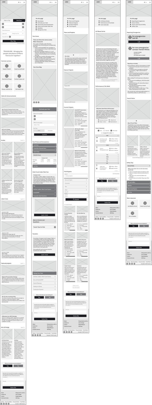
Current Website vs My Redesign
DESKTOP
Home page Before and After
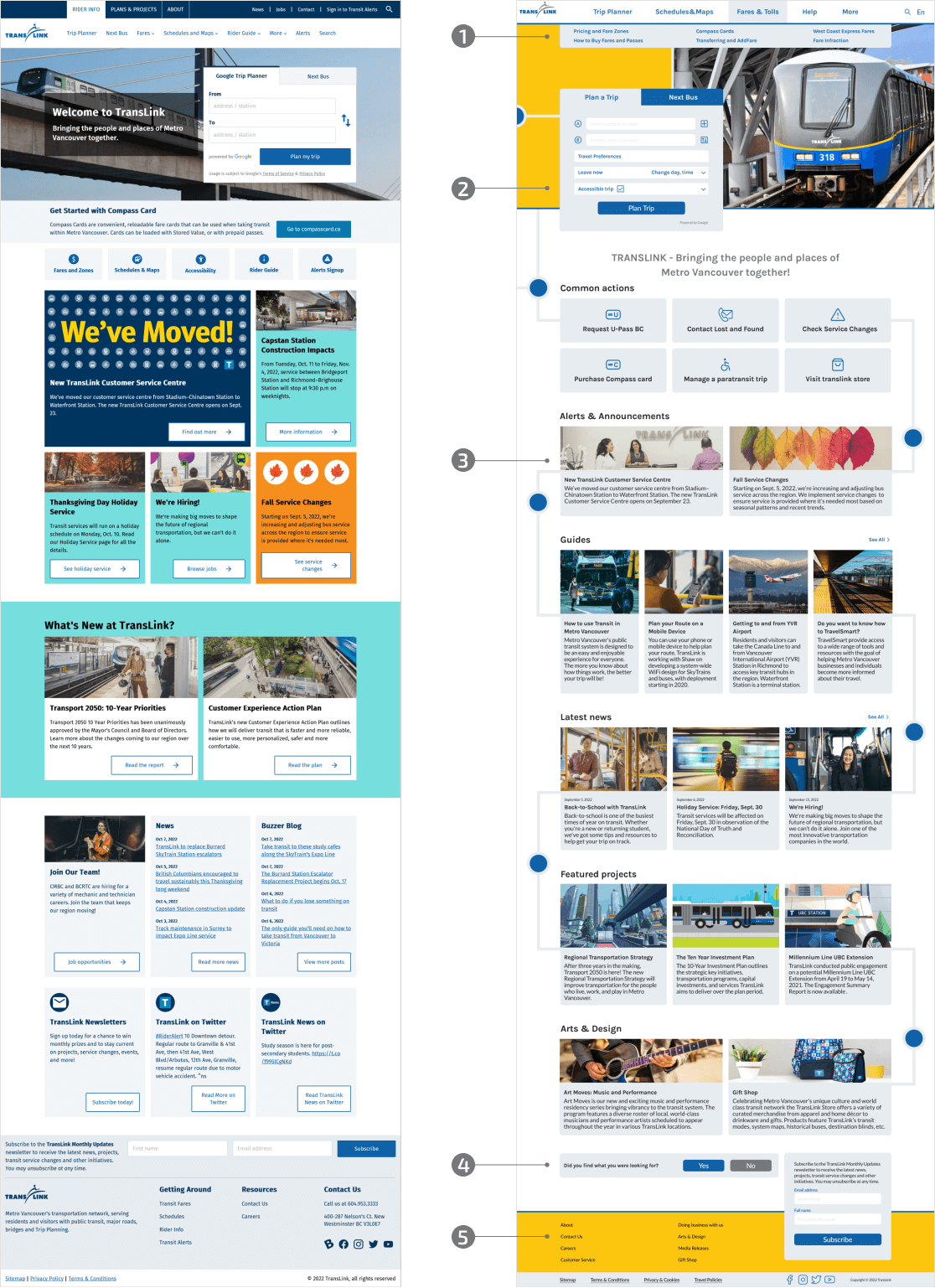
- Convenient menu designed to optimize information search.
- Trip planning as a most used feature was placed at the top of the home page and styled according to chosen design direction.
- Clickable cards become blue on hover and lead the user to access additional information.
- The survey collects user feedback and helps with site navigation.
- The footer allows the user to subscribe to the newsletter, provides the most frequently used navigation options, and describes the company’s policies, rules, and regulations.
Fares & Tolls Before and After
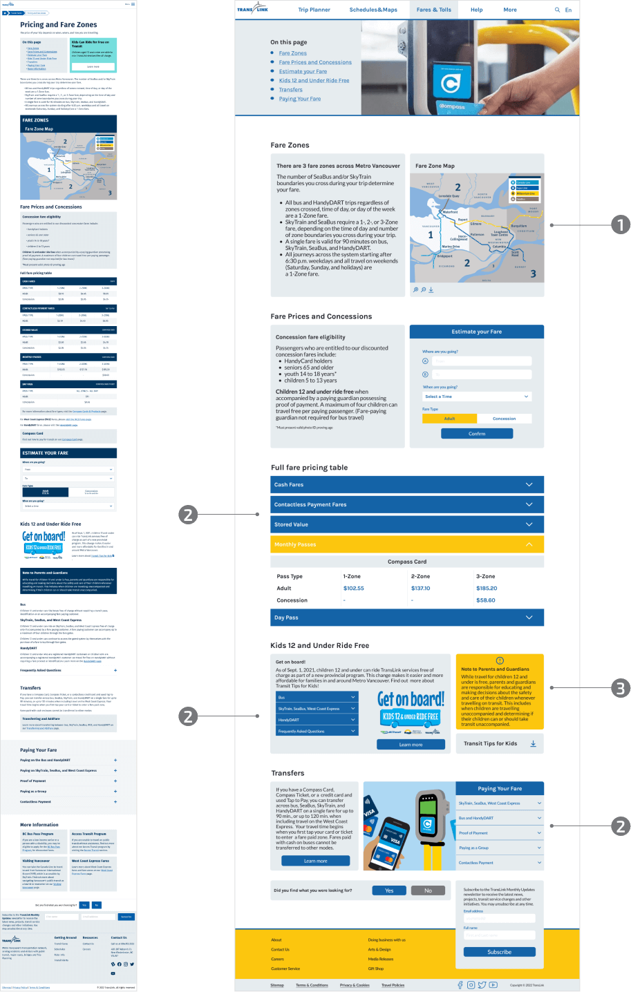
- Interactive map, with zoom function.
- Warnings and notes are highlighted in yellow.
- A compact pricing table, “Paying Your Fare” and “Get on board” elements were created with the use of accordions and drop-down lists, that shorten a page, reduce scrolling, and allowed users to skip or reveal hidden content.
Plans & Projects Before and After
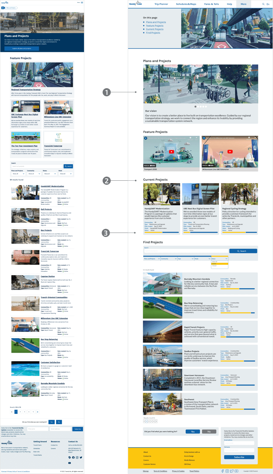
- A brief overview of TransLink strategy regarding system improvement.
- Content is divided into sections with clear headings.
- An indicator that allows you to determine at what stage the project is at the moment.
Art Moves Series Before and After
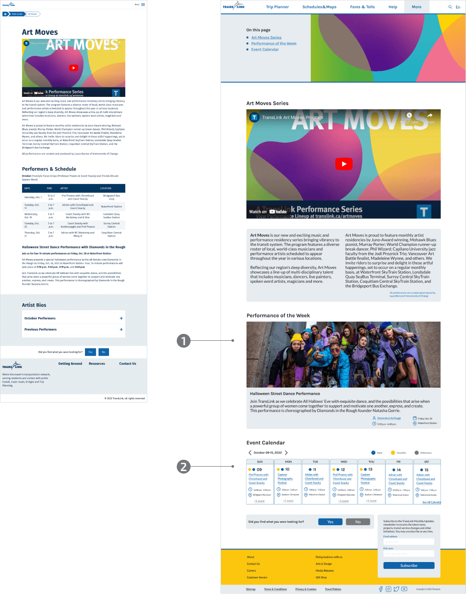
- Photo, text information, and a link to the website of the current week’s performers stimulate the users’ interest.
- Calendar of events with art type differentiation by color: Music, Visual Arts, Performance.
Transit Security & Safety Before and After
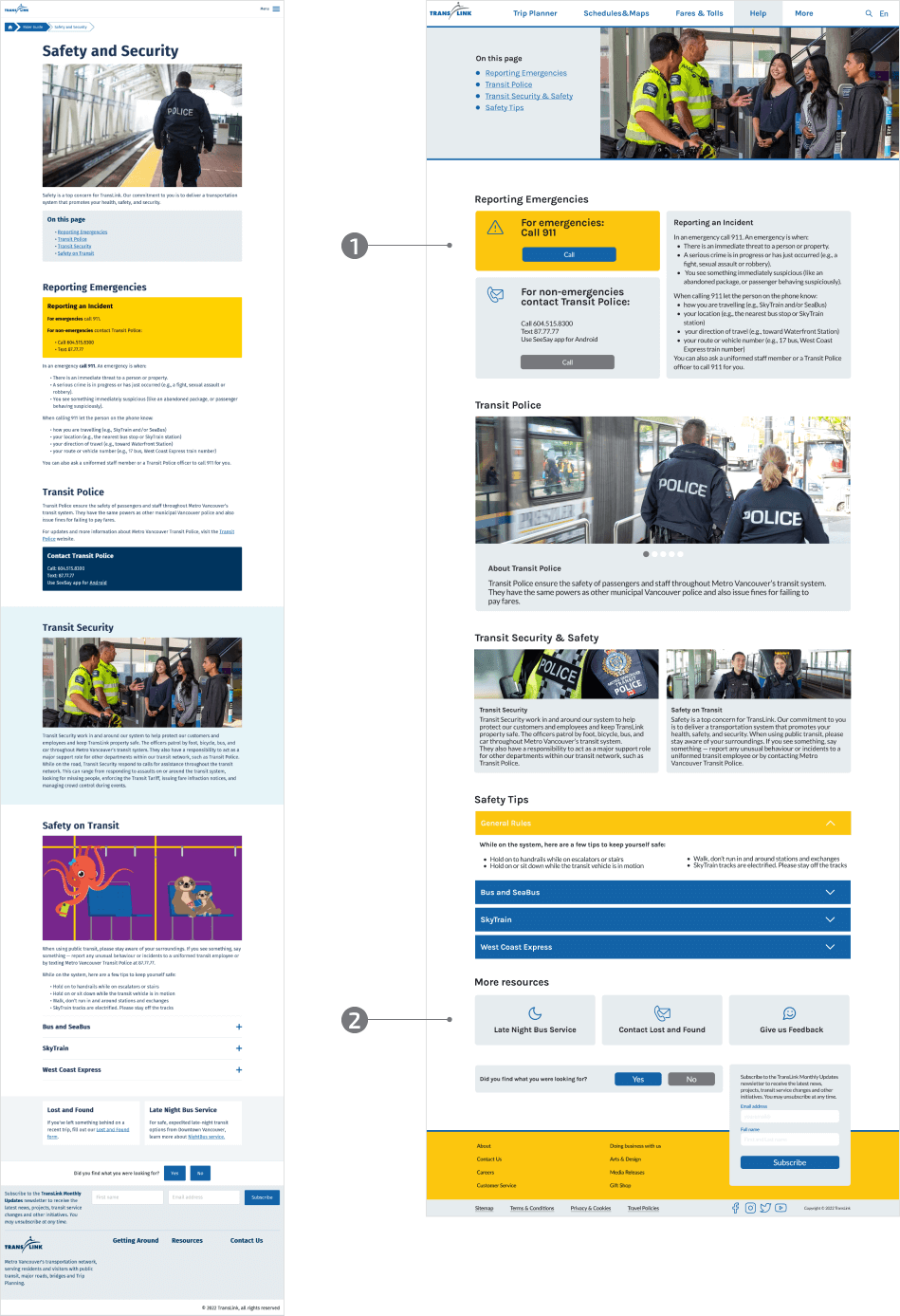
- The emergency response guide is located at the top of the page. It is highlighted in color and in large print. Added “Call” buttons to quickly contact the police and rescue service.
- Recommendation of resources indirectly related to this topic.
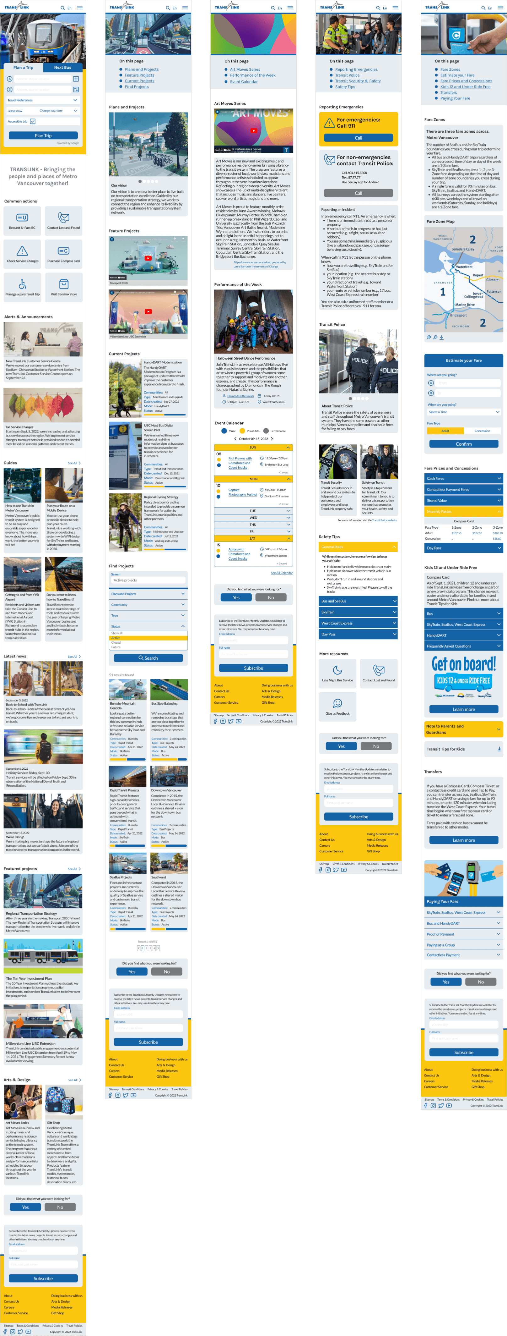
MOBILE
The specificity of the TransLink service implies a high probability that the user will access the site from a mobile phone. Thus, readability, contrast, and a clear layout go a long way.
Tools used